
 A customer apologized to me the other day for wanting actually to see and handle a very modestly priced item before buying it, rather than simply buying it online on the basis of a photograph – and it was a perfectly adequate photograph for most purposes, it must be said. “It’s just not quite the same”, she said. And she was right. It’s a question that has been hovering in my mind over the last couple of months as I’ve been re-photographing or re-scanning thousands of items of stock to provide larger and better images for my website.
It’s an ancient website built in the days when the erratic capacity and performance of dial-up modems (for those of you who can remember them) meant that the file-sizes of such images as there were had to be kept to an absolute minimum. Although piecemeal improvements had been made over the years, it was time for a thorough overhaul. A decent image for absolutely everything on the site.
But as the new images are added day-by-day, the thought recurs over and again that for all that these are better and larger images, they are still not showing me what I actually see when I look at the book, print or map. “It’s just not quite the same”. It’s one of the problems of digitisation generally. However good the image, it really isn’t the same.
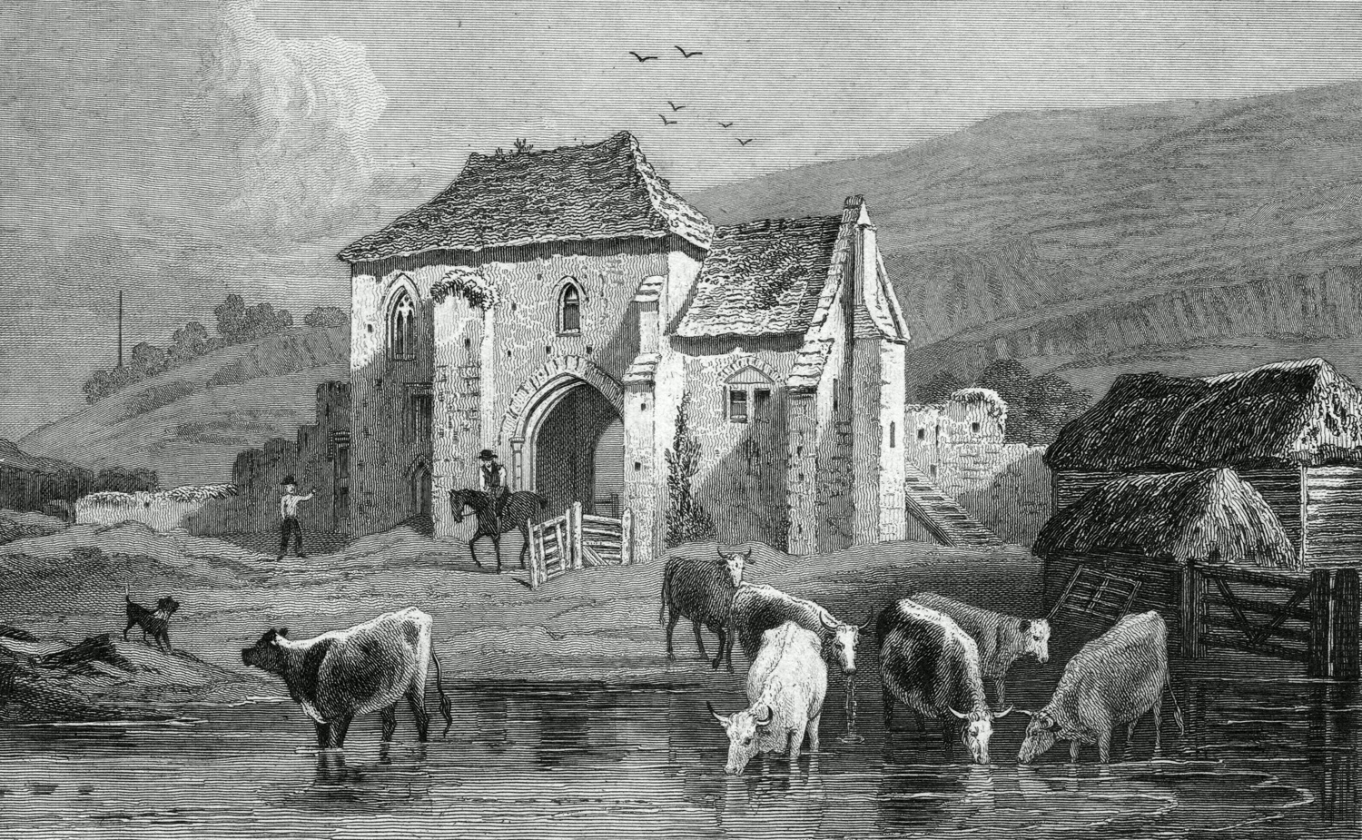
St. Martin’s Priory, near Dover. Kent. 1829. Engraved by Samuel Lacey.
How much more of a problem then in the days before cameras (let alone scanners), when to circulate an image required the skills of an engraver to translate it (in reverse) on to a printing plate or block. I’m not sure that we really appreciate how difficult this was – or how well those long-forgotten engravers succeeded.
Illustrated are two little sketches by the prolific landscape painter Henry Gastineau (1791-1876), who exhibited at the Society of Painters in Water Colours every year for a period of nearly sixty years, right up to the time of his death at the age of eighty-five – some 1,300 pictures in all. He was also responsible for hundreds of these little sketches for the publishers of the view-books and series of views so popular from the 1820s to the 1840s – especially views of Wales, but also of most parts of England, with occasional forays to continental Europe.
The two present views – both of Dover and both dating from the late 1820s – were two of the original drawings made for publication in the part-work “England’s Topographer, or, A New and Complete History of the County of Kent : From the Earliest Records to the Present Time, including every Modern Improvement : Embellished with a Series of Views from Original Drawings”, published by George Virtue between 1828 and 1831 and with text by William Henry Ireland (yes – that Ireland, the Shakespeare forger).
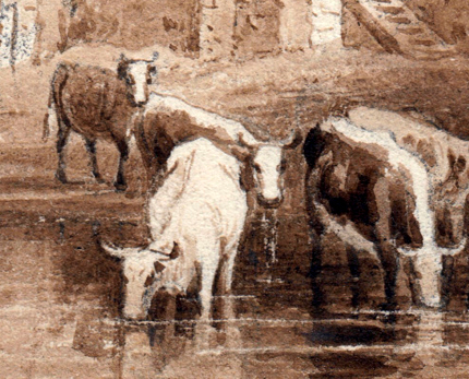 Originally trained as an engraver himself (his mother was Sarah Deeble, presumably of the engraving family – a detail not mentioned by ODNB), Gastineau with his customary skill and competence knew just what was required. His sketches in ink, pencil and sepia wash are exactly the same size as the finished engravings were to be. The first, of the ancient priory of St. Martin of Tours, chartered by Henry I in 1131 and now absorbed into Dover College, was handed over to Samuel Lacey (1786-1859) of Pentonville. Lacey was the son of a London bookbinder, born in Fetter Lane at the heart of the printing trades, and baptised at St. Andrew Holborn on 31st December 1786. Specialising in landscape and architectural work, Lacey became one of the top commercial engravers of his day, employed again and again on projects of this sort.
 His task was to translate Gastineau’s free and flowing sketch into a finished engraving – using a technique of incising the image line by careful line (in reverse) on to a steel plate – a technique just about as far from free and flowing as it is possible to get. Light and flimsy washes rendered by hundreds of closely laid and dovetailing lines (click on the images to enlarge). And yet how well he does it. The mood and tone perhaps different, these are totally different media – but what fidelity to the image itself. As close as it is possible to get to what the artist originally recorded.
The second sketch, of Dover Castle, was given to Henry Adlard (1799-1893) to engrave. The son of a London printer and part of an extensive book-trade family, Adlard was just as prolific and as skilled as Gastineau and Lacey. His engraving and copper-plate printing business was employing over thirty men by the 1860s and his eye and expertise were often called for in the rôle of an expert witness in deception and forgery trials. In his work on this Gastineau sketch there is perhaps a little more use of standard formulaic work, especially in his handling of the greenery in the foreground, but we can also note how he has tidied up Gastineau’s depiction of the tiny yacht and the distant horse and wagon to the right of the image. Again, we can only marvel at the skill and endless patience which must have been involved.

We perhaps don’t recognise these skills enough. These steel engravings and the books they are found in are routinely under-catalogued and largely undervalued. Are they as good a representation of Gastineau’s sketches as a colour photograph or a digital scan might have been? Obviously not. But which we would rather have is perhaps a rather different question. All the images are here, scanned at high resolution – but you are still not seeing their real texture and depth. You are still not seeing quite what I am seeing.

Dover Castle, Kent. 1828. Engraved by Henry Adlard.

Thank you for the background on H. Adlard. I am researching JMW Turner’s prints https://studiorum.itservices.manchester.ac.uk/
Rawlinson’s catalogue lists Adlard as the engraver of a number of prints in the 1830s, but was unable to discover where they were published. Have you come acorss them in your years of experience, and where I could I find them?
LikeLike
Thank you. We seem never to have come across these prints, but Rawlinson’s note that they were published by J. Duncan of Paternoster Row gives a clue. I think they come from Josiah Conder’s “Italy”, published by James Duncan in three volumes in 1831.
LikeLike